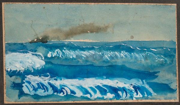
Ship on Fire (1914)
Dad was 11 when he painted this. Certainly not a masterpiece in any sense, but there is more subtlety than might first appear. There is a gap between the sky and the sea and he chose quite different colours for them. The ship itself is just suggested by the smoke issuing from it (with various splodges of watery paint) but it is enough to be convincing. I love the waves which make me smile with their rhythm, and he has used a stronger blue to suggest the troughs between the waves.
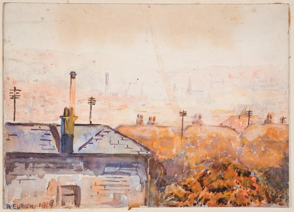
From My Attic Window, 8 Mornington Villas, Bradford (1919)
For a 16-year old this is perhaps hardly exceptional stuff. But by now he was already beginning to experiment with oil paint and this picture shows his understanding of the main differences in the two mediums. It is suggestive and not explicit…. really it is only the telegraph poles which get detailed treatment and the chimney with its interesting shadow. This may have been painted as a sort of farewell to Bradford as the family moved shortly to Ilkley on account of his mother’s health.
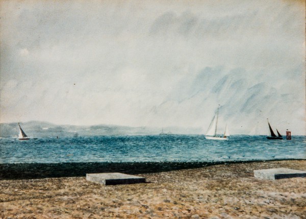
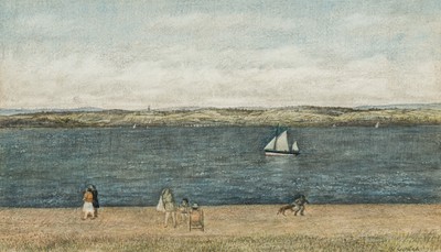
Boats at Lepe (c1979)
Dad didn’t often use watercolour in later life. But here it is used to dramatic effect. Those concrete slabs are remarkable! Their weight and significance strike a note which is backed up by the dark seaweed-laden lower part of the beach. By contrast the transparency of the watercolour helps to lend buoyancy to the lively sea and sky.